
Improving the Online Store for T-Shirts and Grunge

My Role
UX Designer
User Research (Survey Design, Interviews)
Information Architecture
Client Liaison
Contract Work
During this 3-month, part-time contract project, our team of two UX designers worked with Sub Pop to improve their web store as they migrate to Shopify. After research and usability testing with customers, we were able to recommend design solutions to stakeholders.
Client
Sub Pop is a Seattle-based record label that defined the grunge era with Nirvana and Mudhoney and continues to push the music industry with Beach House and Orville Peck.

Problem
How can Sub Pop meet its business goals through its upcoming Shopify migration while improving the customer experience?
Project Summary
Research leads to recommendations
Sub Pop is in the process of moving their in-house built web store, the Mega Mart, to the Shopify platform. We were brought on to do research and user testing to identify pain points, help Sub Pop understand customer motivations, and provide recommendations as they move forward with the project.
We recommended user-centered solutions including information architecture, visual design, interaction, as well as business considerations.
We presented our work to stakeholders ranging from the CEO to the dev team. We delivered a detailed document containing our findings, design solutions, and further recommendations to provide a guidebook for Sub Pop’s migration journey.
A record label is a unique business
A record label web store provides unique challenges. There is a vast number of music releases, all for sale on multiple formats (LP, CD, Cassette). There is also a large number of non-music items ranging from t-shirts and hoodies to blankets and playing cards and 1,000 products in between.
The current store was built with only music and t-shirts in mind. As the range of items for sale has grown, the structure of the store has not.

Customer Interview

Current web store homepage
Research and Findings

It all starts with a hat
At the very beginning of the project, I began exploring the Mega Mart. I knew Sub Pop sold hats, many types: baseball, trucker, beanie. I could not find a way to navigate to a hat of any sort without using search. The hat became a simple place for us to focus our efforts.
Top Search Terms
Beating Nirvana in the charts
In looking at the analytics, “Hat” was the #1 search term across the Mega Mart, beating out Nirvana. I wasn’t the only one trying to find a hat.
With the hat as a jumping-off point, we created a list of observations and questions to guide our research. We had questions about labels, Navigation, user expectations, branding/marketing, layout, user behavior, and more.


User Group
Music nerds don't hold back
We brought in 6 customers for interviews and usability tests on the current web store. The group was recruited through the Sub Pop email list. They ranged from super customers to low volume shoppers, and shades in between.
We gave them common online shopping tasks (one, of course, involving a hat). We observed and recorded their work. We learned a lot about the unique behavior of music fans. We uncovered how they think about new releases, their awareness of non-music items and, how their frame of mind differs between shopping on a store like Target verses the Sub Pop Mega Mart.
Usability Testing
The current web store was frustrating for our users
Based on tasks using the current Mega Mart, we asked users to rate their experience from 1-7 (7 being perfect, wouldn’t change a thing) The average rating was a 3.
Some examples of users’ frustration were things like unclear navigation items, lack of filtering for category pages and search results, confusing visual hierarchy. All of those frustrations and more resulted in long times on tasks and an overall negative experience for the users.
Current Web Store Experience

Customer Survey
Many of our findings came as a surprise to the stakeholders
Based on qualitative patterns we found through stakeholder interviews and user testing, we wrote a survey to validate those themes quantitatively.
We launched a comprehensive survey to current Sub Pop customers. We gathered over 2,000 responses. The responses gave us great insights regarding customers’ knowledge of Sub Pop products and marketing, essential demographic stats, their mental models around shopping on a record label web store and, their music taste.
The survey data isn’t appropriate to share here. I’d be happy to discuss our findings in person.Recommendations
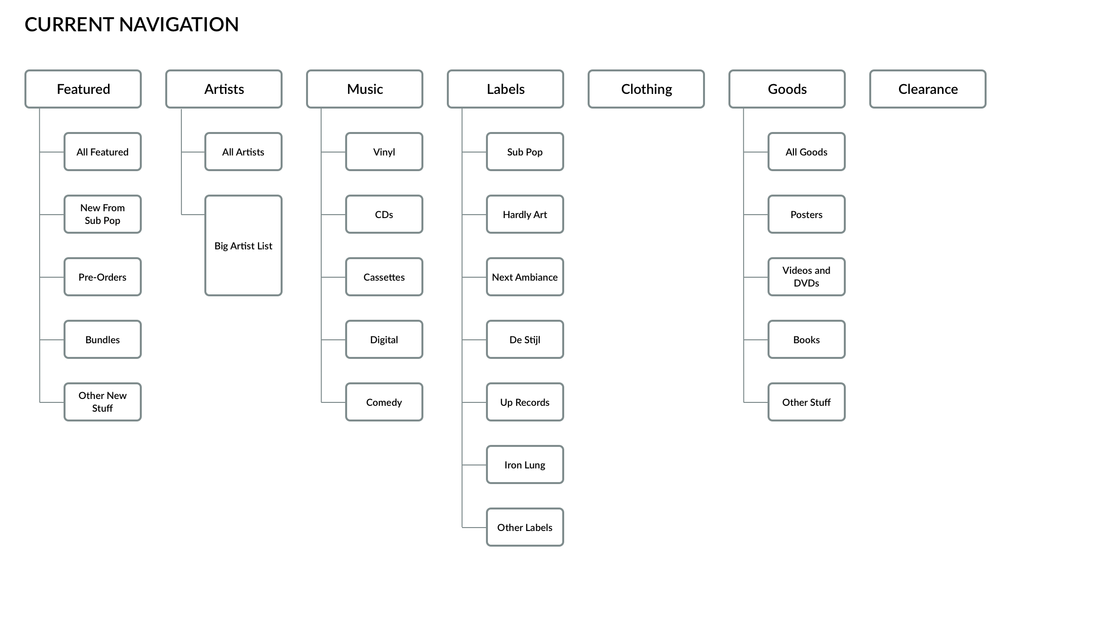
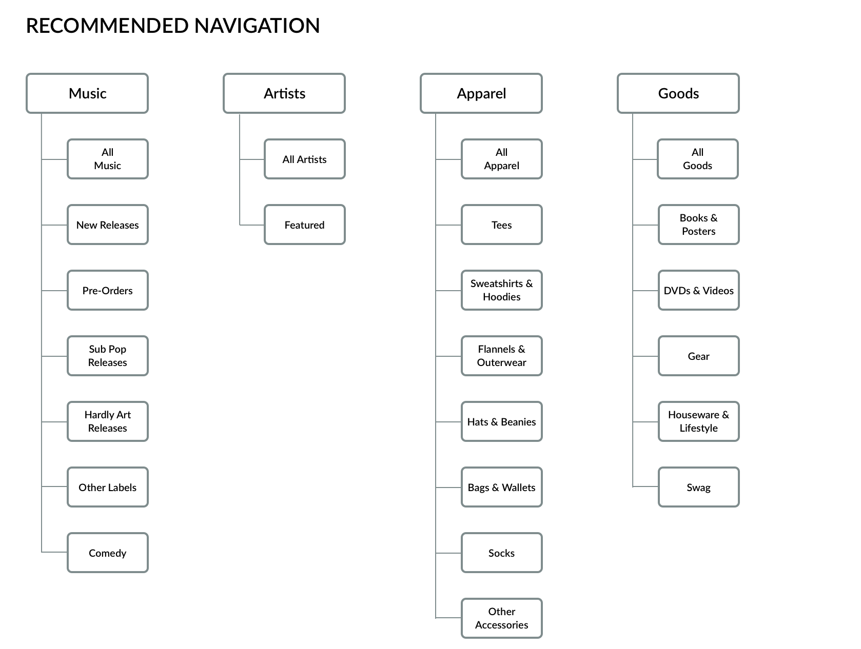
Navigation
Expectations in labeling and organization
Through looking at the analytics, observing heat maps and, conducting an open card sort, we recommended an all-new Navigation structure.

Heat map of the current home page over 6 weeks
Recommended Navigation
Simplified and clear
We simplified the main Navigation and added much-needed Sub-Navigation. We focused on Apparel and Goods, making sure each category was browsable through Sub-Navigation.
Through tree testing, user tasks, and business goals, we reorganized the menu structure to match the expectations of the customer.
Our user group provided great feedback, mostly validating the new design, but also offering some insight on how to iterate, i.e., Comedy and All Category items.
Filters
Give the people what they want
To go hand in hand with Navigation is Filtering. The current site has no filtering features. We heard from stakeholders that this was an important part of the move to Shopify. Customers showed us that they naturally expect that sort of functionality when shopping online.
While the scope of the project didn’t include building a full filtering and labeling system, we were able to test a few scenarios to show how essential filtering is to users. We wanted to illustrate to the dev team that every part of this should be considered as they move forward.


Mid-fi prototype of Music Category
Mid-fi prototype of Goods Category
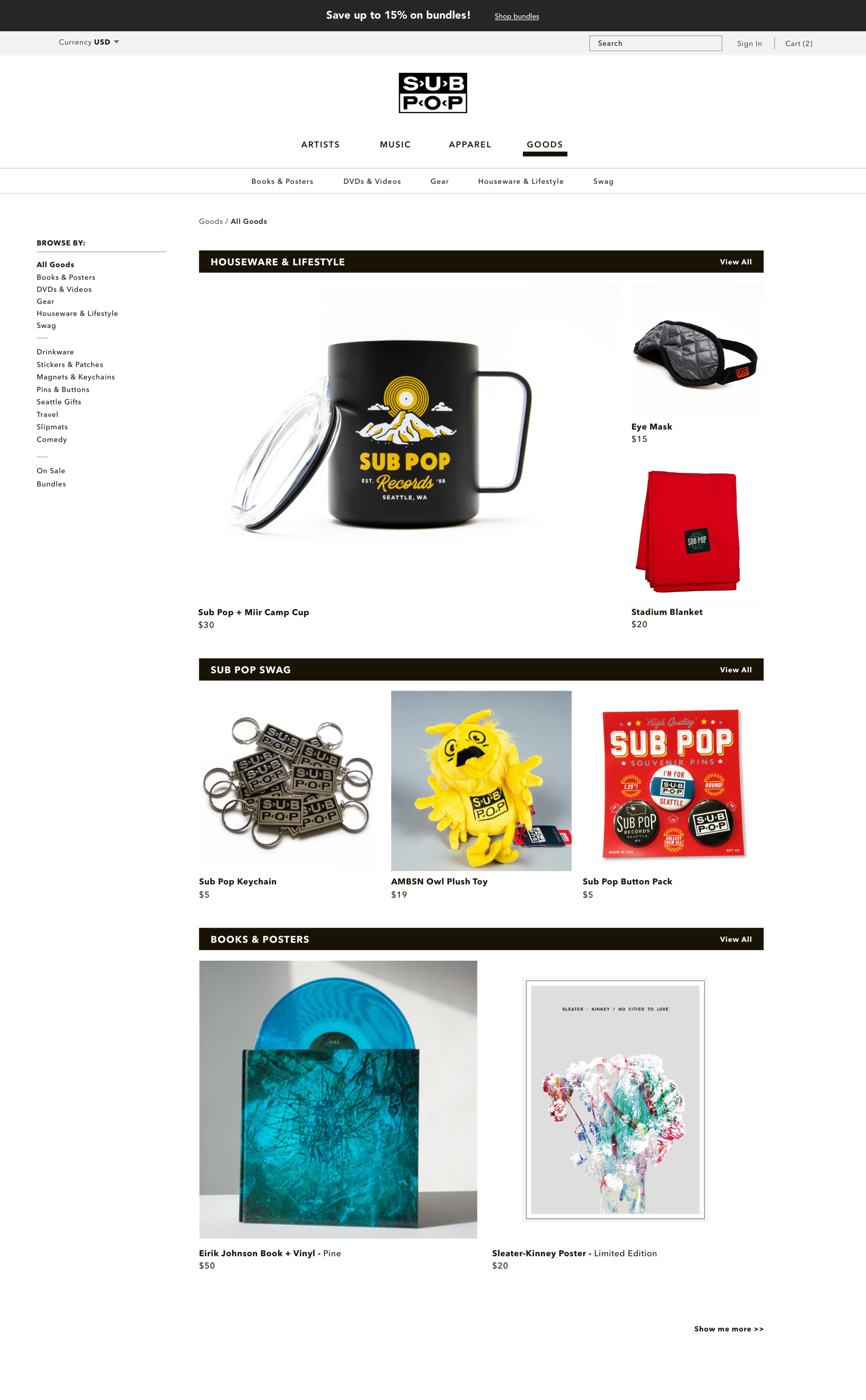
Landing Pages
Serving up products and information with style
For each of the main categories: Music, Artists, Apparel, Goods, we mocked up a landing page. We wanted to test with users, how they might browse when given large images and products featured by size and placement rather than simply what is above the fold.
Sub Pop already has a collection of engaging product images featuring bands wearing apparel items. They haven’t used them much on the current store.
We found that customers liked the landing page style when they were browsing and preferred a simple grid with filters when trying to find a specific product or group of products.
User Testing Round 2
Our returning users were happy with the changes
After completing similar tasks using our mid-fi prototype, the same user group rated the experience between 6-7.
“This time 7, definitely. I feel like I struggled last time. This is much better.”
“It’s Good. It’s definitely an improvement.”
- User group participants

Further Considerations
We gave the Sub Pop team some other topics to consider as they move forward.
Handoff Document
A template by which Sub Pop can build a project roadmap
As we collected insights and understanding of what it would take to move from the current web store to the Shopify platform, our team began compiling everything into a handoff document.
Knowing we couldn’t tackle everything during the short contract timeline, we felt it important to create a guide book for next steps as the company continues the migration.
The document contains things like:
- Survey findings
- Analytics stats
- Interaction considerations
- Stakeholder business goals
- Customer mental models

Not the real documents
Consideration Examples
Bundles
Where business meets interaction
We found that users’ mental models for multiple item bundles are varied. The interaction is potentially complex. Business decisions on what type and how many bundles to offer must be considered before the design and interaction can be executed.

Product Page Mid-Fi Prototype

Left: Current Mega Mart - Right: Google Ad Example
Right Rail Blindness
Visual design is more than just making it pretty
The current Mega Mart has promotions and featured items in the right column on most pages. These look just like Google ads that we see across the internet. Right rail blindness results in customers not registering that the promo is even there. This is backed up by heat map stats showing very few clicks.
Expanded Artist Page
Keep users engaged
Something that came up over and over again was the amount of information provided on an artist page. The current store only displays music releases and merch for and artist in a grid.
Having more information about the artist, featuring their latest release, and showing tour dates or news items would help keep users on the Mega Mart website.

Outcome
Stakeholder Presentation
Is it a gold record?
We presented our findings, recommendations, and considerations to seven stakeholders ranging from the CEO to the development team. Our findings sparked lots of conversation and follow up questions.
The aforementioned handoff document will serve as a reference and roadmap for their continued work to migrate the Mega Mart to Shopify.
